
As owner of Retro Kandy Vintage, I recognized that our navigation system was not meeting the needs of our customers. Our current navigation makes it difficult for users to discover the unique treasures we offer. To address this, I plan to reimagine the categorization structure, focusing on clear, era-specific groupings that reflect the nostalgia of vintage shopping.
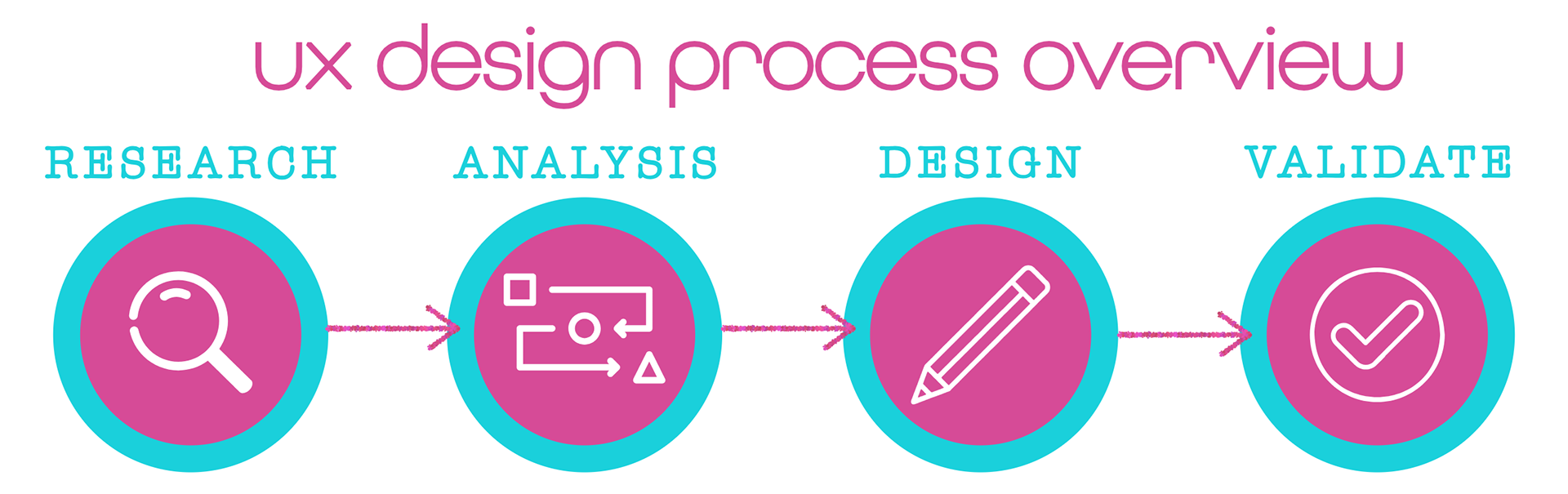

To understand how users interact with vintage products and improve navigation for Retro Kandy Vintage, I began the research process with competitive benchmarking. This helped to evaluate how other vintage retailers structure their navigation and engage users. The information provided valuable context for identifying the best practices and areas where Retro Kandy Vintage could differentiate itself. I also surveyed regular customers to uncover their browsing habits and favorite product categories, providing insights into their shopping preferences. I also analyzed historical data from Shopify, including search terms and purchasing patterns, to identify trends and gaps in the browsing experience.
competitive benchmarking
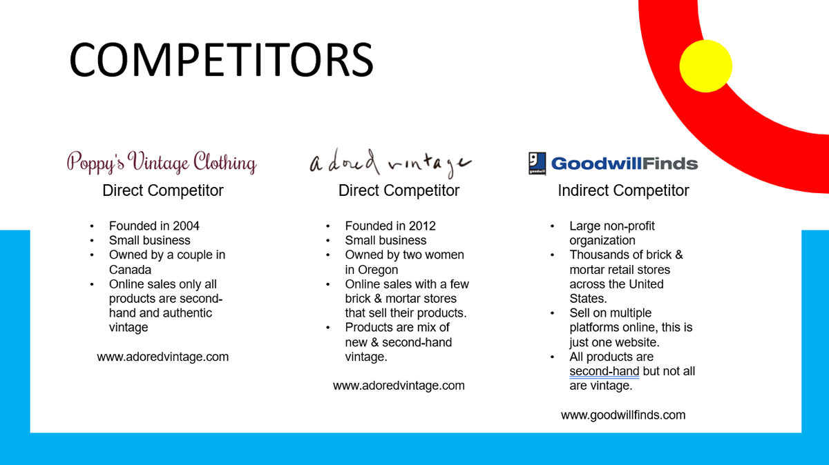
The 3 websites compared & analyzed for competitive benchmarking.
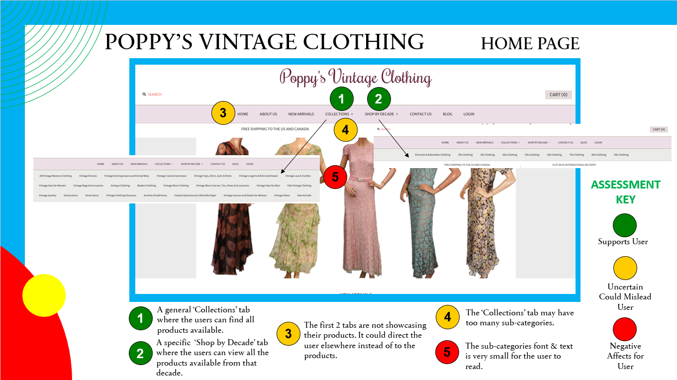
An example of a page from the Power Point document displaying some positive and possible pain points of the websites.
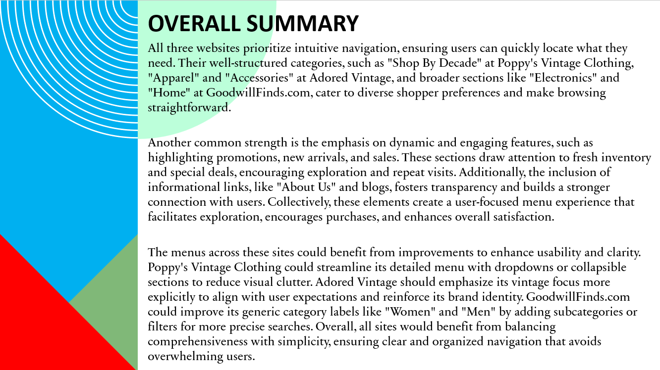
The final overall summary of the findings for the competitive benchmarking presentation.
popular searches in 2024
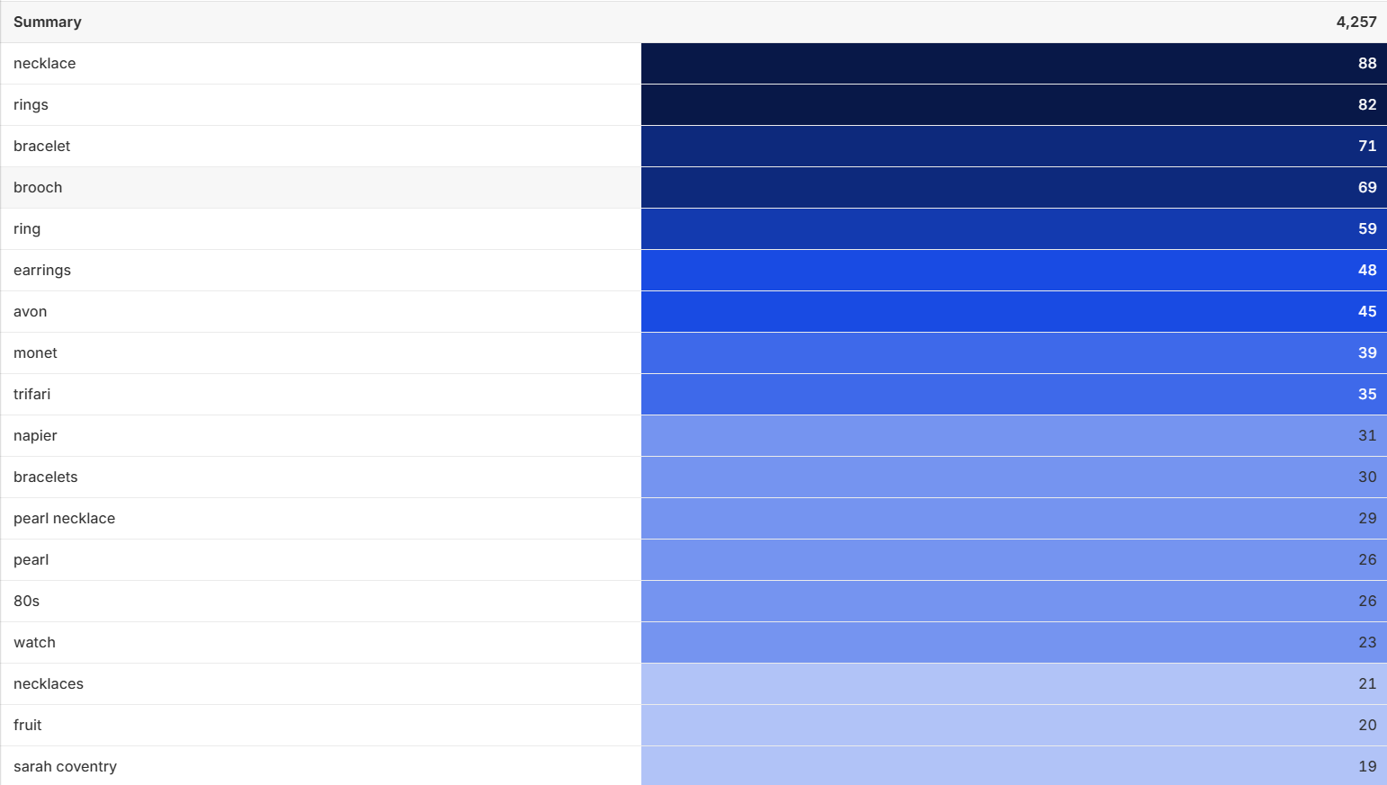
Above: Retro Kandy Vintage's Top Search Terms in 2024.
The Shopify analytics reports for 2024 showed that users tended to use the search on the website for general categories rather than specific brand names. The analytics also reveal that when users were to search on the web, they often focus on specific brands.
usability test & notes
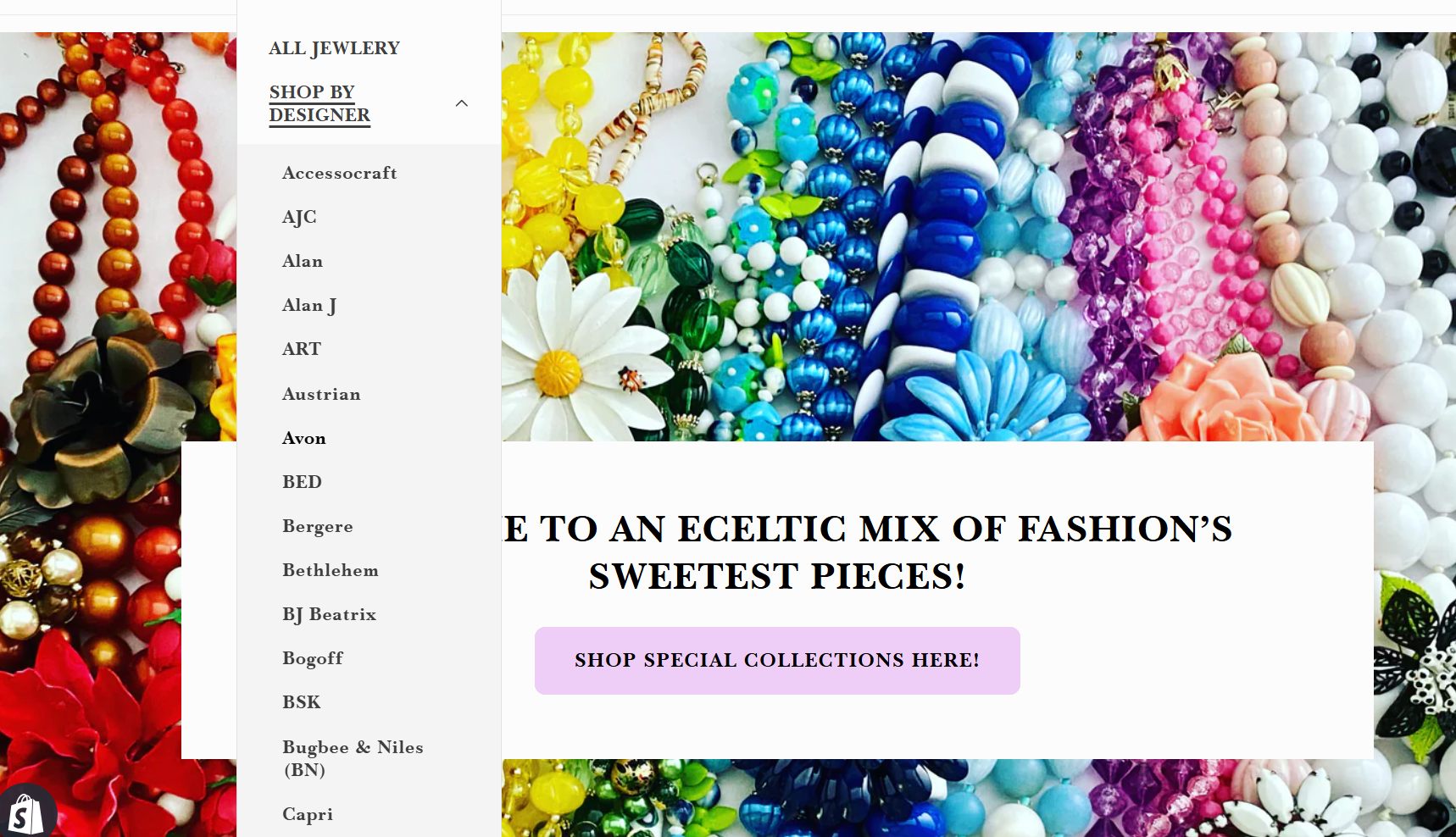
To better understand user behavior, I observed users navigating through Retro Kandy Vintage. The goal of the test was to evaluate how easily a typical user can navigate the website and find product categories. The usability test proved that the text of the navigation bar was not always legible. Most appeared uncertain about which category to choose, especially if they were unfamiliar with vintage brands. This uncertainty often creating overwhelming feelings, with some users becoming frustrated and bypassing the navigation entirely to use the search bar. They frequently typed in specific decades or categories to find what they were looking for. One user said that the 'SHOP ALL' section in the center of the page was confusing and overwhelming. These were just some of the insights that highlighted the need for clearer, more intuitive categorization to guide users effectively and reduce friction in their journey.
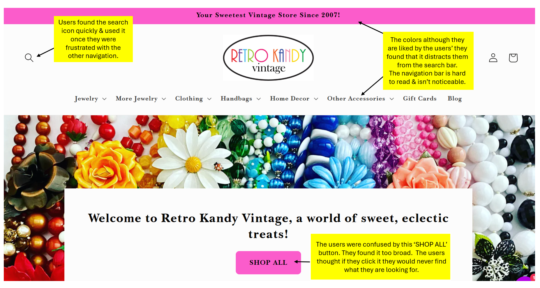
Above: Main points made during the usability test.
"I really love the colorful vibe, but the navigation labels can be a bit hard to read."
-A quote from a user during a usability test.

The primary goal of analyzing the research data on Retro Kandy Vintage was to identify pain points that hinder users from intuitively finding and exploring products. To achieve this, I first created a customer journey map to visualize the notes and data collected during the usability tests.
customer journey map
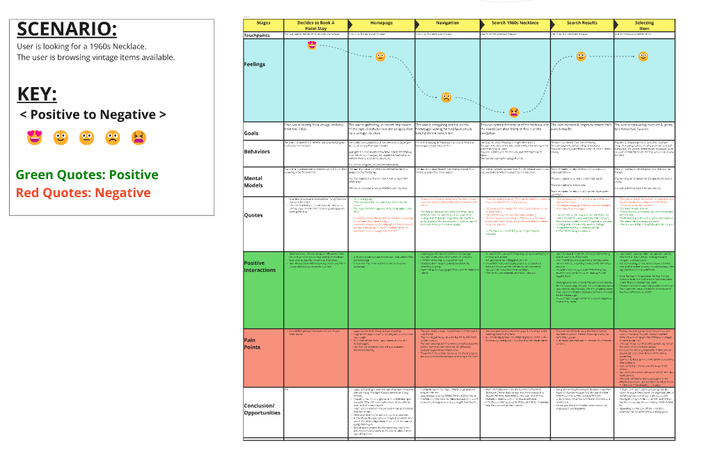
Above: Customer Journey Map for Retro Kandy Vintage.
The customer journey map complements the mind map by illustrating how users interact with Retro Kandy Vintage over time. It tracks the users' path from the moment they land on the homepage to the point they (attempt to) find and explore products. Specific moments of frustration—like encountering ambiguous categories or needing to rely on the search bar—are highlighted to show when and why users might feel lost or exit the site prematurely. By visualizing these touchpoints, the journey map pinpoints precisely where navigation improvements can have the greatest impact, ultimately helping to create a more intuitive and satisfying user experience.
"Recognition rather than recall." -One of ten Heuristics.
This principle emphasizes that users should be able to see available options and navigation cues rather than having to remember them, reducing cognitive load and minimizing errors. In the case of Retro Kandy Vintage, ambiguous category labels and a lack of clear visual indicators force users to rely on memory to navigate, leading to frustration and inefficient browsing. By ensuring that navigation elements are immediately visible and intuitively organized, the site can significantly enhance user experience.
mind map
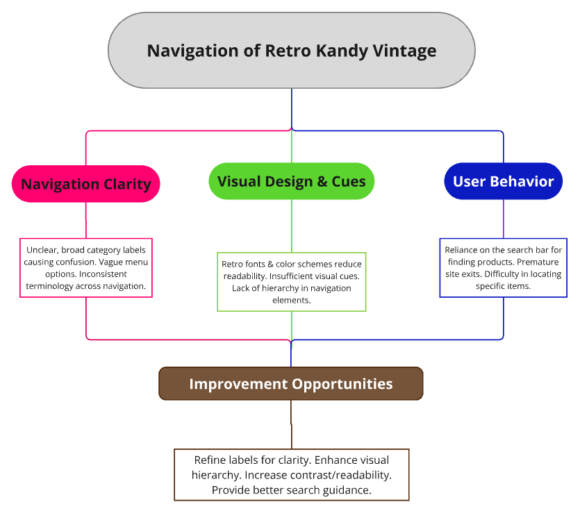
Above: Navigation Mind Map for Retro Kandy Vintage
The mind map provides a high-level view of the primary navigation challenges on Retro Kandy Vintage, grouping them into three main categories: Navigation Clarity, Visual Design & Cues, and User Behavior. Under Navigation Clarity, issues include unclear or overly broad category labels, vague menu options, and inconsistent terminology—factors that confuse users and impede product discovery. Visual Design & Cues focuses on how retro fonts, color schemes, and a lack of hierarchical elements reduce readability and make navigation less intuitive. Finally, the User Behavior section highlights how these challenges lead to reliance on the search bar, premature site exits, and difficulties in locating specific items. The mind map concludes with Improvement Opportunities, such as refining labels for clarity, enhancing the visual hierarchy, increasing contrast for better readability, and offering more targeted search guidance.

I began by creating a flow diagram that focuses exclusively on how users move through a site’s navigation from the homepage to relevant categories or sections. By examining existing user research and analytics, I identified the most common paths and potential points of confusion. Then I visually charted each step of the navigation, including page hierarchies and key decision points. The flow diagram acts as a clear blueprint for refining labels, layout, and visual cues in later design stages, resulting in a more intuitive and cohesive navigation experience.
flow diagram
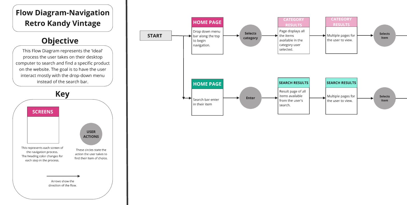
Above: A section from the flow diagram.
hand-sketches
After establishing the navigation flow, my next step is to translate these pathways into tangible design concepts through hand sketches. Working with a pencil and paper allows me to quickly explore multiple layout options and visual hierarchies without the constraints of digital tools. This flexible approach encourages experimentation, helping me uncover creative solutions for organizing content and guiding users to key sections.
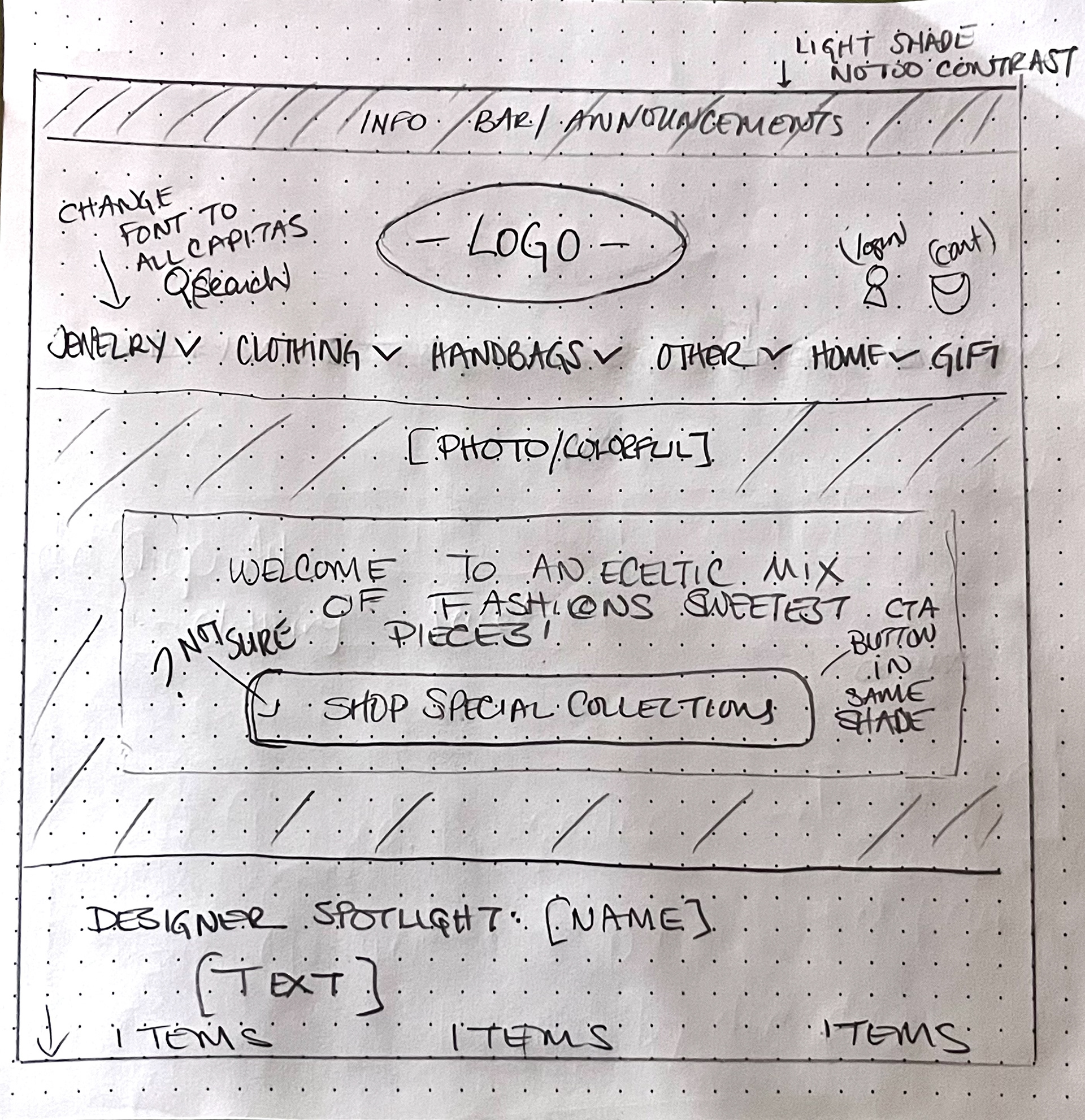
1) Adjustments to the homepage navigation
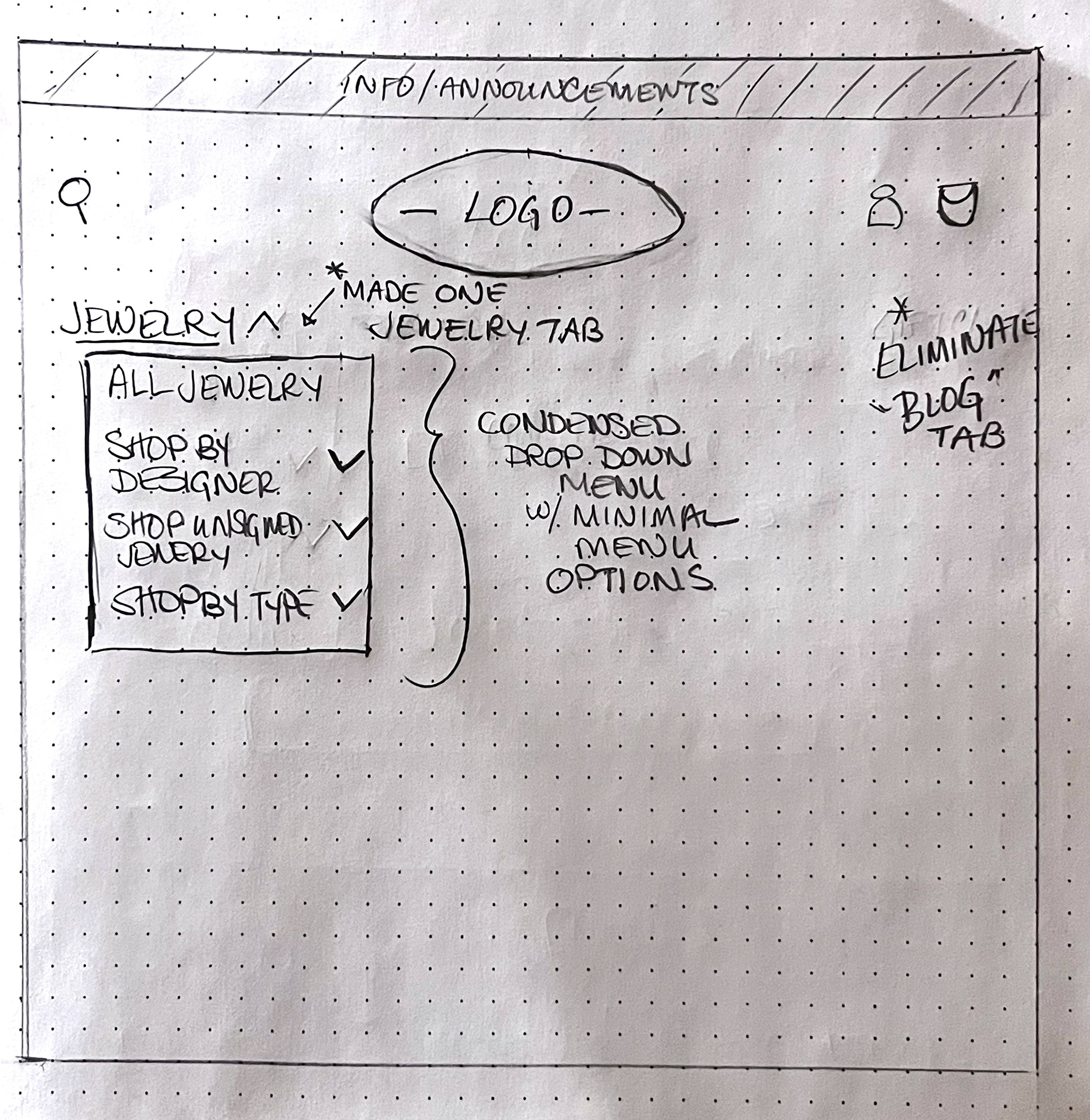
2) Adjustments to the dropdown menus.
Navigation Clarity
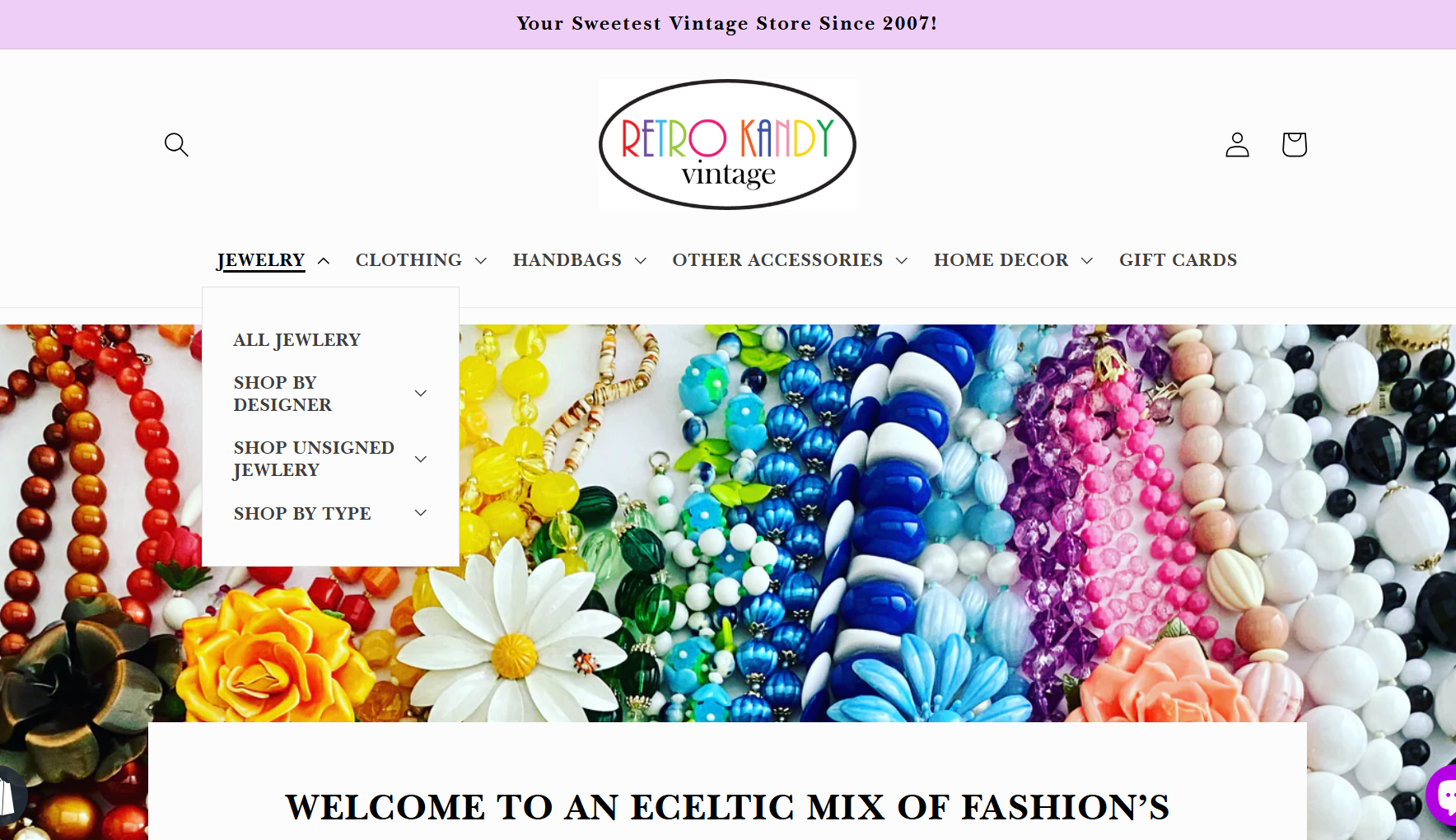
To enhance navigation clarity, I began by reorganizing product categories into distinct groups rather than relying on broad, ambiguous groupings. This helped reduce confusion for the user. I also eliminated some categories and refined the labeling throughout the site, ensuring that each menu option was both descriptive and consistent. Overall, these changes will give more of an intuitive structure that allowed visitors to explore the site with greater ease and confidence.
Visual Design & Cues
To create a more inviting and engaging look for Retro Kandy Vintage, I refined the color palette to reduce the contrast. This ensured that the text remained easy to read against background elements. I also introduced consistent typography throughout the site, opting for a modern typeface that aligns with the brand identity while prioritizing legibility. Collectively, these adjustments establish a welcoming atmosphere and built user trust, making the website feel more approachable and user-friendly.
User Behavior
Users often relied on the search function as their first step. Therefore, I enhanced its performance by optimizing relevant keywords and introducing filter options. This allowed visitors to quickly locate specific items—like “1960s beaded necklaces”—without having to sift through irrelevant listings.

To validate and address the navigation issues, I implemented targeted updates on the Shopify website, enabling me to test proposed solutions and collect user feedback. This involved reorganizing product categories, refining labels for clarity, and introducing clearer visual cues throughout the interface. I then monitored user behavior through analytics and conducted quick usability tests to ensure these changes improved overall navigation and reduced friction.
usability test

To validate and address the navigation issues, I implemented targeted updates on the Shopify website, enabling me to test proposed solutions and collect user feedback. This involved reorganizing product categories, refining labels for clarity, and introducing clearer visual cues throughout the interface. I then monitored user behavior through analytics and conducted quick usability tests to ensure these changes improved overall navigation and reduced friction. By focusing on the initial adjustments based on real-world data, I was able to confirm which strategies were most effective in guiding users seamlessly through the site.