This UX project was the key assignment in fulfilling the requirements of my UX Design diploma. For this project, I chose to redesign a hotel booking website for the desktop computer, a decision driven by my interest in streamlining user interactions within the travel industry. This being a school project, time and resources were limited. I was responsible for all steps of the UX process for this project.
My initial approach involved studying similar digital platforms and observing real users interacting with them. Through this research, I identified several points of friction and opportunities for improvement. I then defined and articulated the core problems, creating a clear structure for the large volume of data collected. This framework became the foundation for designing intuitive flows, interactions, and testing of the final solution.
I began my research with competitive benchmarking. I chose a two-point perspective for my research, focusing on both user experience and industry standards, to ensure a balanced and comprehensive approach. I reviewed the websites of similar hotel booking companies, which helped me gain a deeper understanding of how other brands address challenges in the booking process. Through this analysis, I was able to identify common patterns and recurring issues across different platforms, providing valuable insights into user pain points and opportunities for improvement.
competitive benchmarking
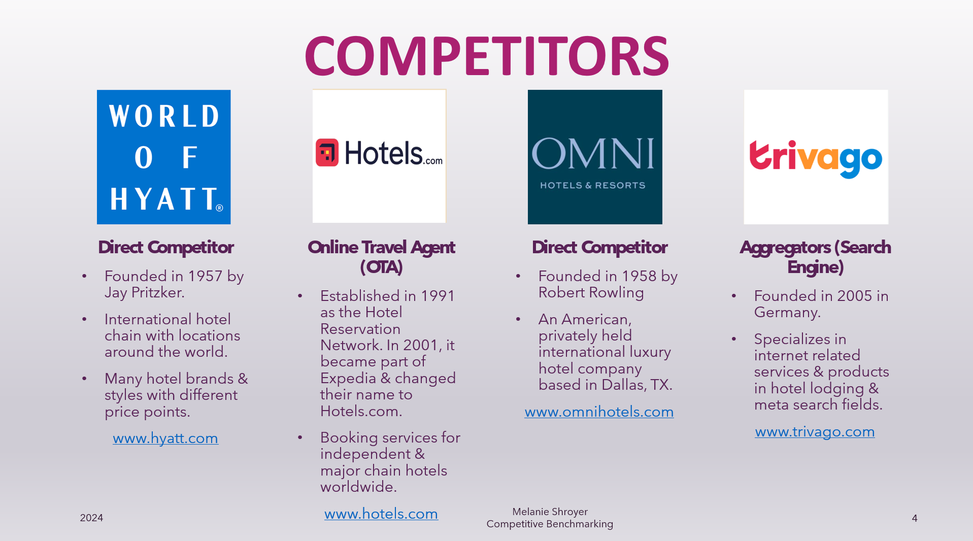
The 4 websites compared & analyzed for competitive benchmarking.
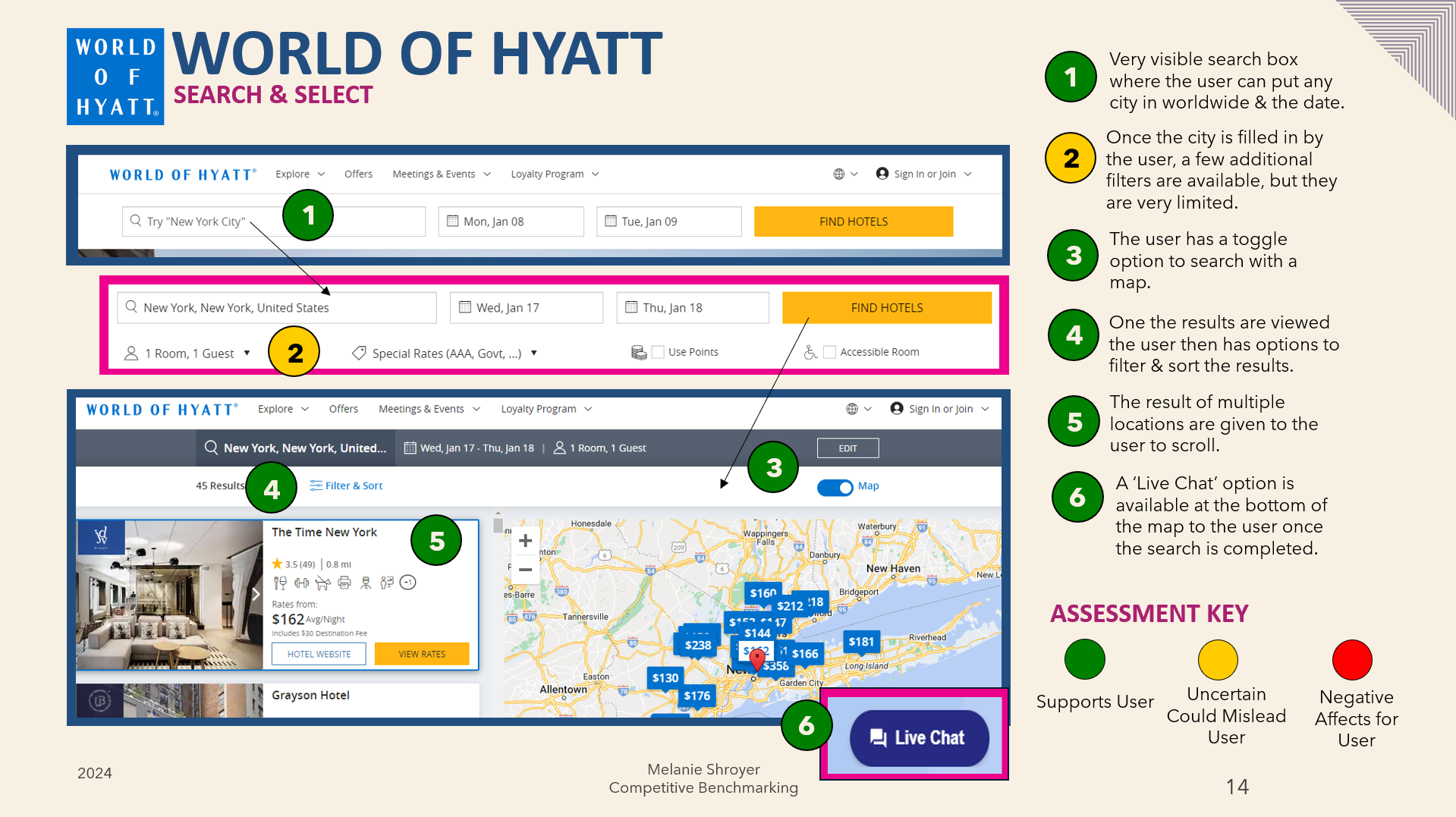
An example of a page from the Power Point document displaying some positive and possible pain points of the websites
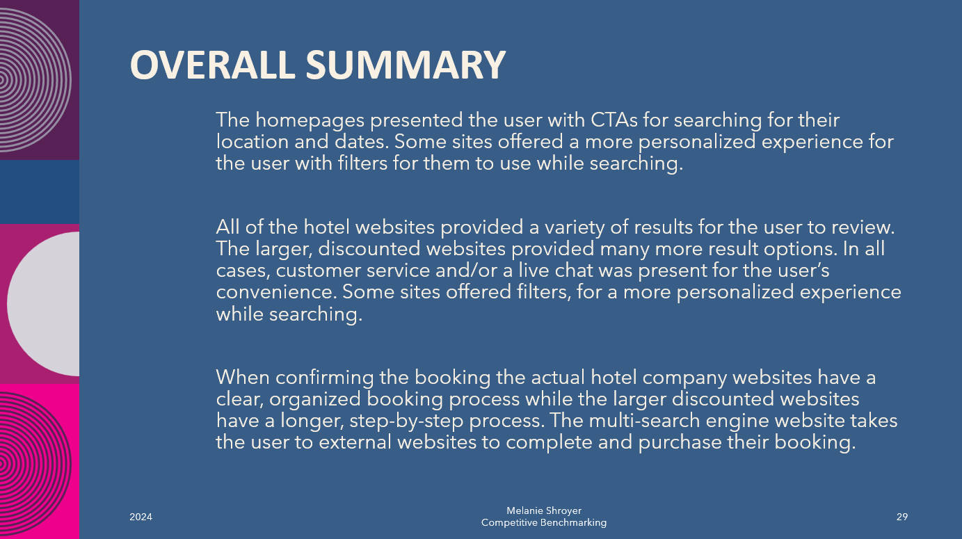
The final overall summary of the findings for the competitive benchmarking presentation.
I continued my research by taking detailed notes from usability tests and organizing the findings into a PowerPoint presentation. Additionally, I conducted my own usability test using the Lookback platform to gather firsthand insights and better understand user interactions with the website.
usability tests & notes
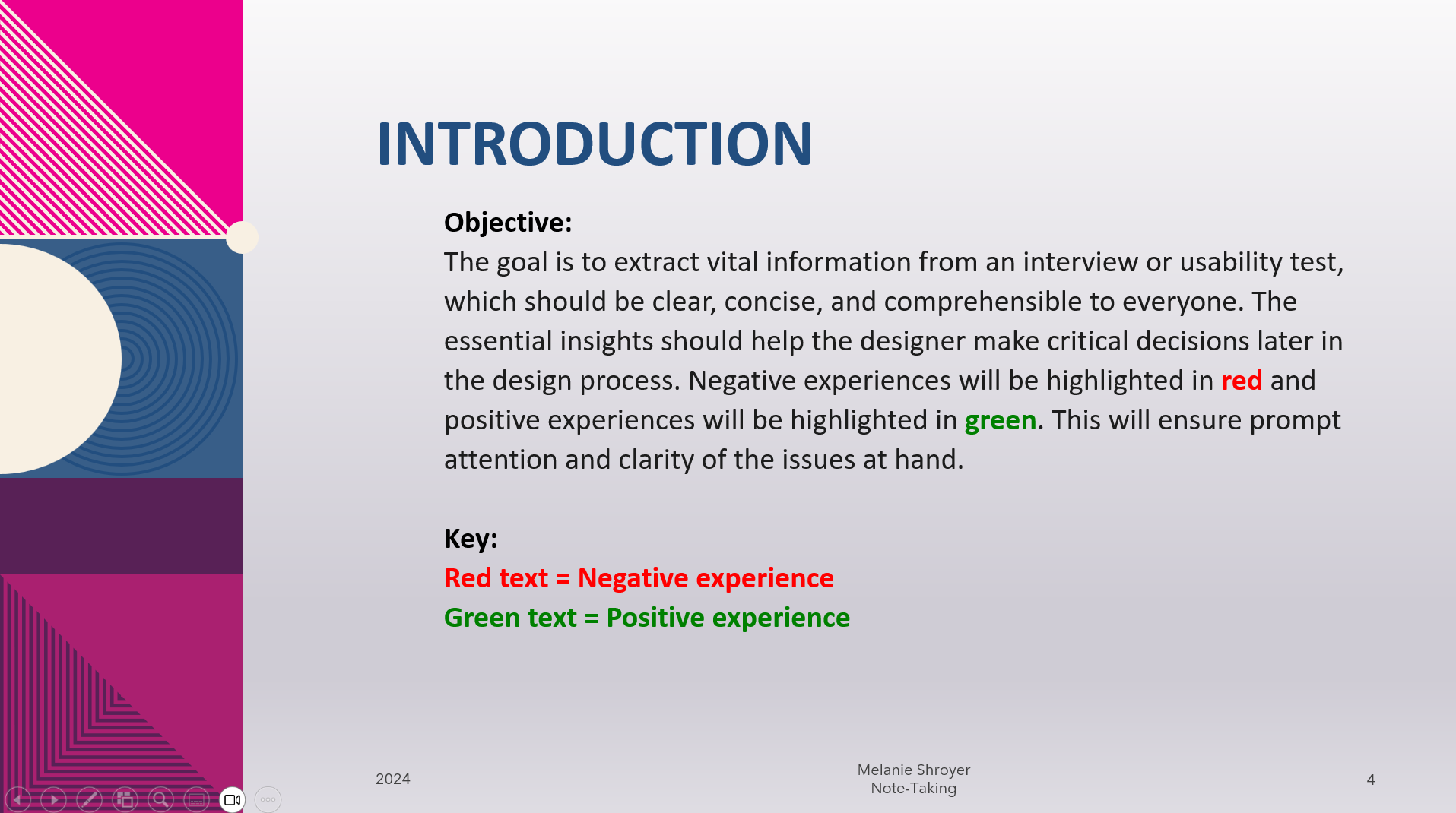
Introduction to the Note-Taking presentation from watching the usability test.
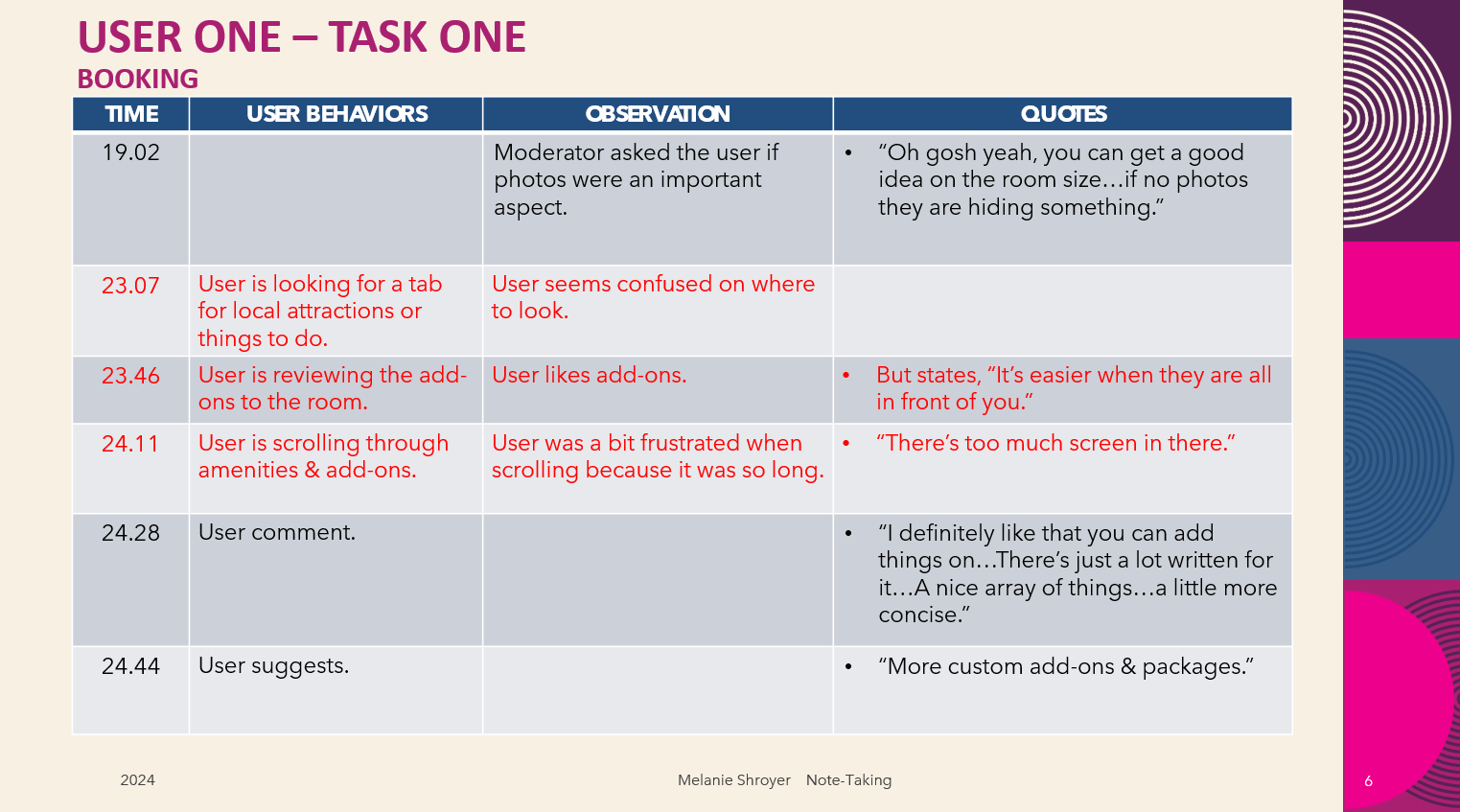
An example of the Note-Taking in the presentation.
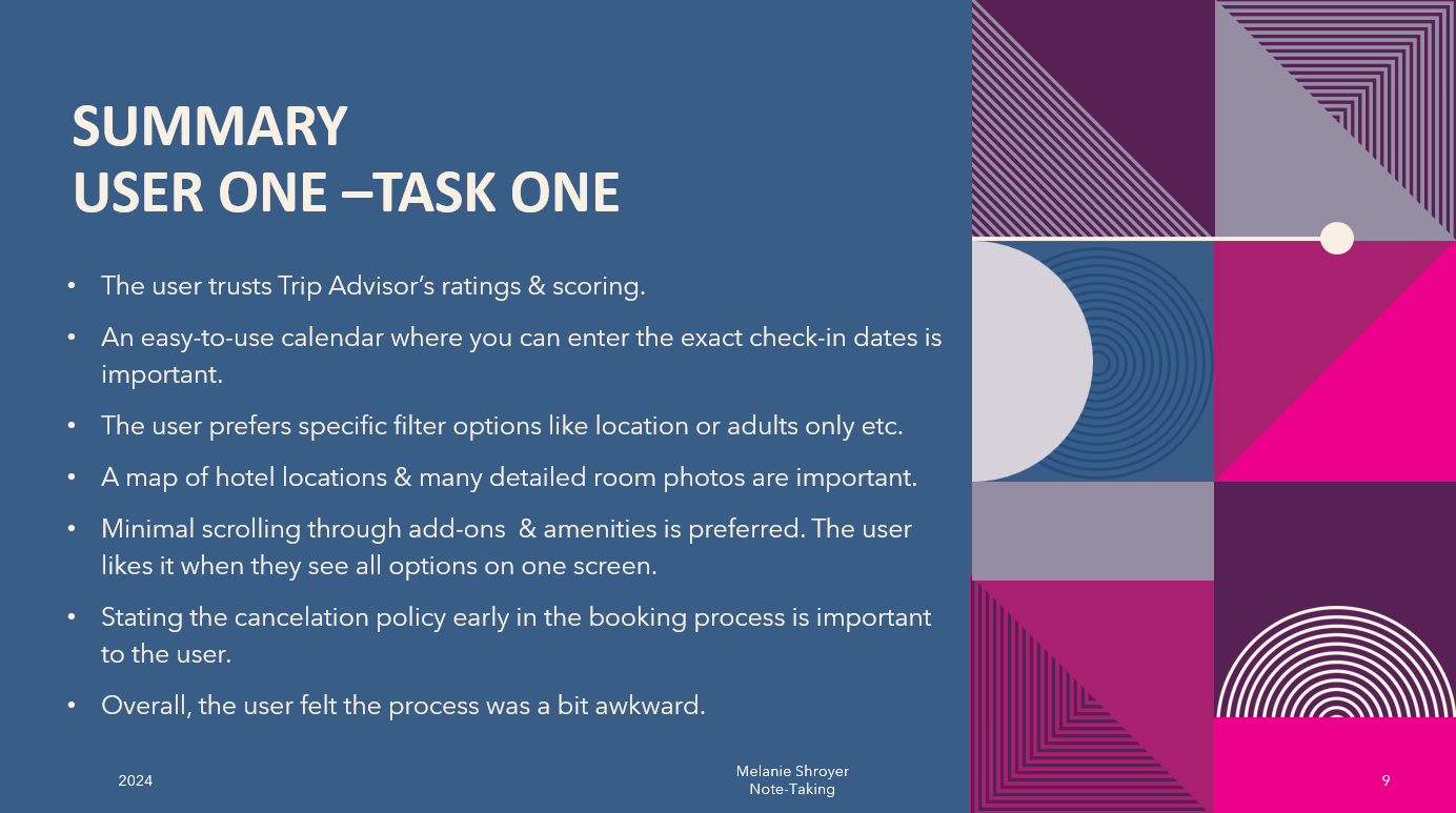
A summary page from the Note-Taking presentation.
"If I'm sitting here this long to figure out what it means...it becomes annoying and frustrating."
-A quote from a user during a usability test.
An excerpt from the usability test.
Through my research, I learned that branding and visuals are crucial in setting the tone for a hotel booking website. Logos help users quickly identify whether the site is budget-friendly or luxurious, while photos create excitement and inspire bookings.
Key functional elements, such as clean, organized calendars and visible search boxes with clear CTAs, are essential for guiding users effectively. Map options and additional filters were often missing but highly desired by users to enhance their search.
Promotions and discounts, while intended to attract users, were frequently overlooked or caused confusion. Floating search bars and CTAs helped maintain user engagement, encouraging actions like starting a search, downloading apps, or joining loyalty programs. However, limited access to customer support, often requiring users to log in, led to frustration.
Overall, successful hotel booking websites prioritize intuitive navigation, thoughtful design, and well-executed tools to create a seamless and satisfying user experience.
To analyze the unstructured data I had gathered, I created an affinity diagram and a customer journey map. These tools allowed me to identify patterns and uncover key insights about the hotel booking process.
My primary goal was to identify the pain points and challenges users face during their booking experience, providing a foundation for targeted design solutions.
affinity diagram
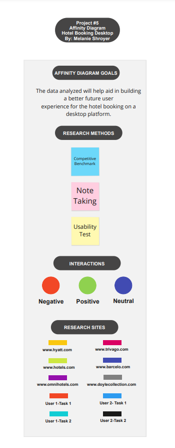
Affinity Diagram Key
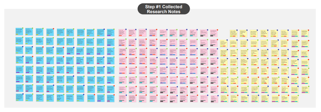
Step #1: All research notes collected & organized.
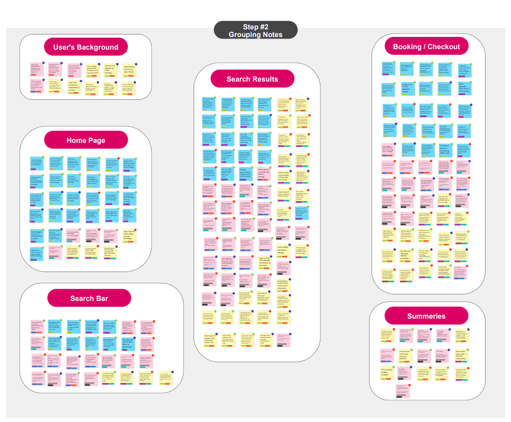
Step #2: Notes grouped in categories.
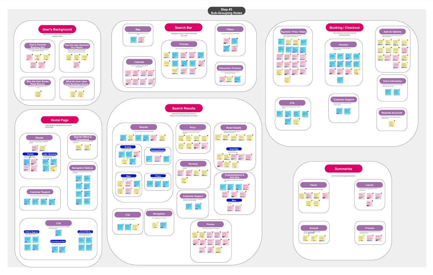
Step #3: Notes grouped in sub-groups.
"Software should not waste the user’s time."
-One of ten Heuristics.
customer journey map
In conclusion, the hotel booking process reveals several key pain points that hinder the user's experience.
The search functionality often lacks prominence, limited filtering options and missing map integration that seem to leave users without the tools needed to refine their searches effectively.
Calendars that are cluttered or poorly organized add unnecessary friction to the process. Promotional offers and discounts, while intended to entice users, are frequently overlooked and/or caused confusion.
Unclear CTAs and limited access to customer support further exacerbate frustration. The inconsistent use of floating search bars may eliminate opportunities to maintain user engagement.
Additionally, visuals and branding sometimes fail to align with the site’s target audience. This tends to lead to mixed messages about the experiences offered. Addressing these issues is essential to crafting a more seamless, intuitive, and engaging booking journey that not only fulfills users' needs but also supports the hotel's business objectives.
I initiated my design process by crafting a flow diagram to map out the ideal user journey and identify where the key pain points needed to be addressed.
flow diagram
After creating the ideal flow, I hand-sketched the screens to visualize and refine the layout, focusing on improving search visibility, simplifying the calendar design, and addressing CTAs and user engagement.
This approach allowed me to quickly iterate and resolve the following key issues in the hotel booking journey, ultimately creating a more intuitive, user-centered experience.
hand-sketches
Search Functionality
The search feature lacked prominence, with limited filtering options and no map integration, leaving users unable to refine searches effectively. My redesign focused on creating a prominent, intuitive search interface. Incorporating these advanced filters and map integrations enhance usability during the Home Page and Hotel Search stages.
Calendars & Date Selection
Cluttered and disorganized calendars created unnecessary friction for users selecting check-in and check-out dates. I developed streamlined calendar designs with clear visuals and user-friendly navigation, ensuring an effortless Date Selection process.
Promotions & Discounts
Promotional offers were often overlooked or confusing, particularly in the Hotel Search, Room Selection, and Booking/Checkout stages. My sketches improved the visibility and clarity of promotional offers, presenting them in a way that enhanced user engagement and understanding.
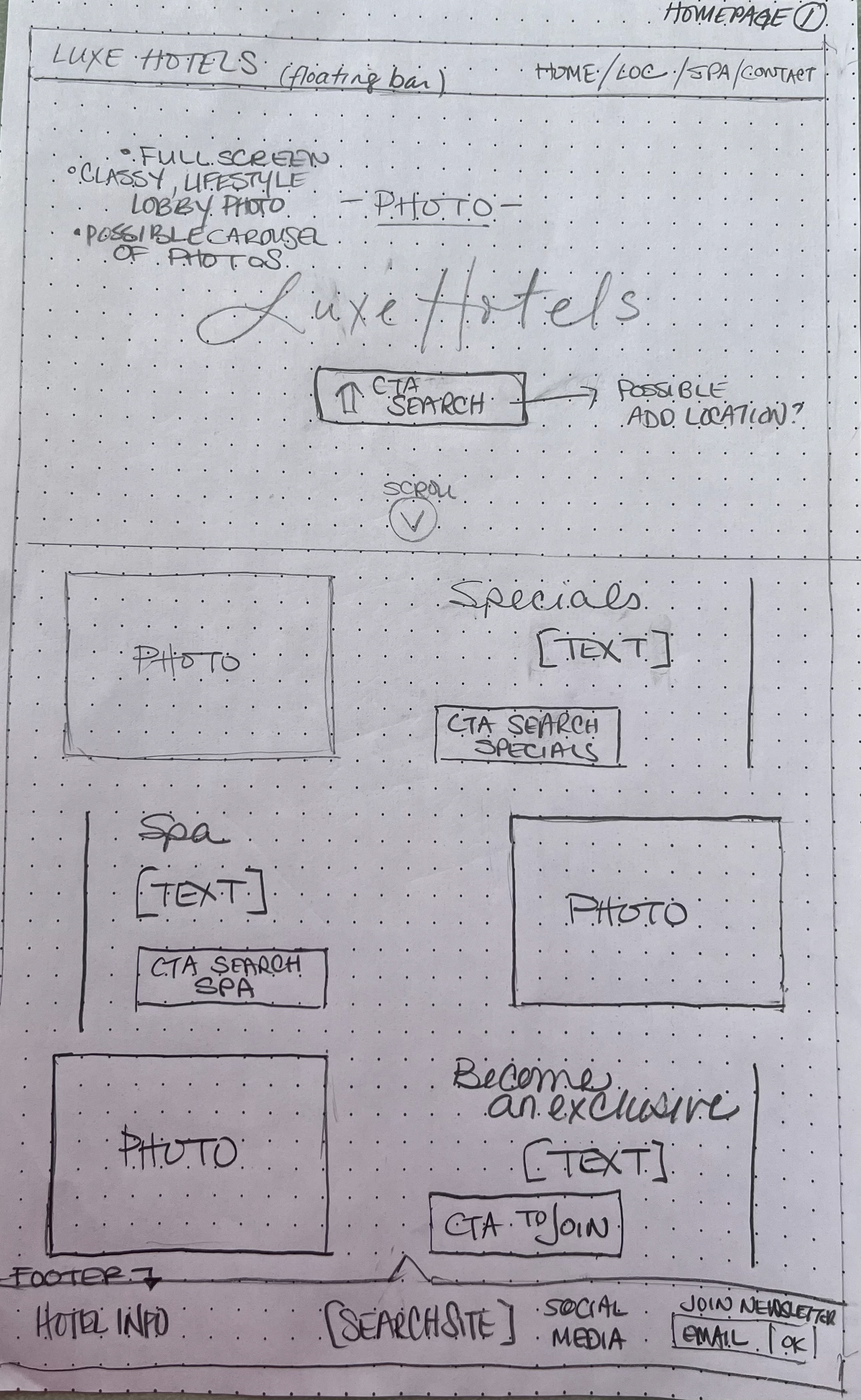
Homepage
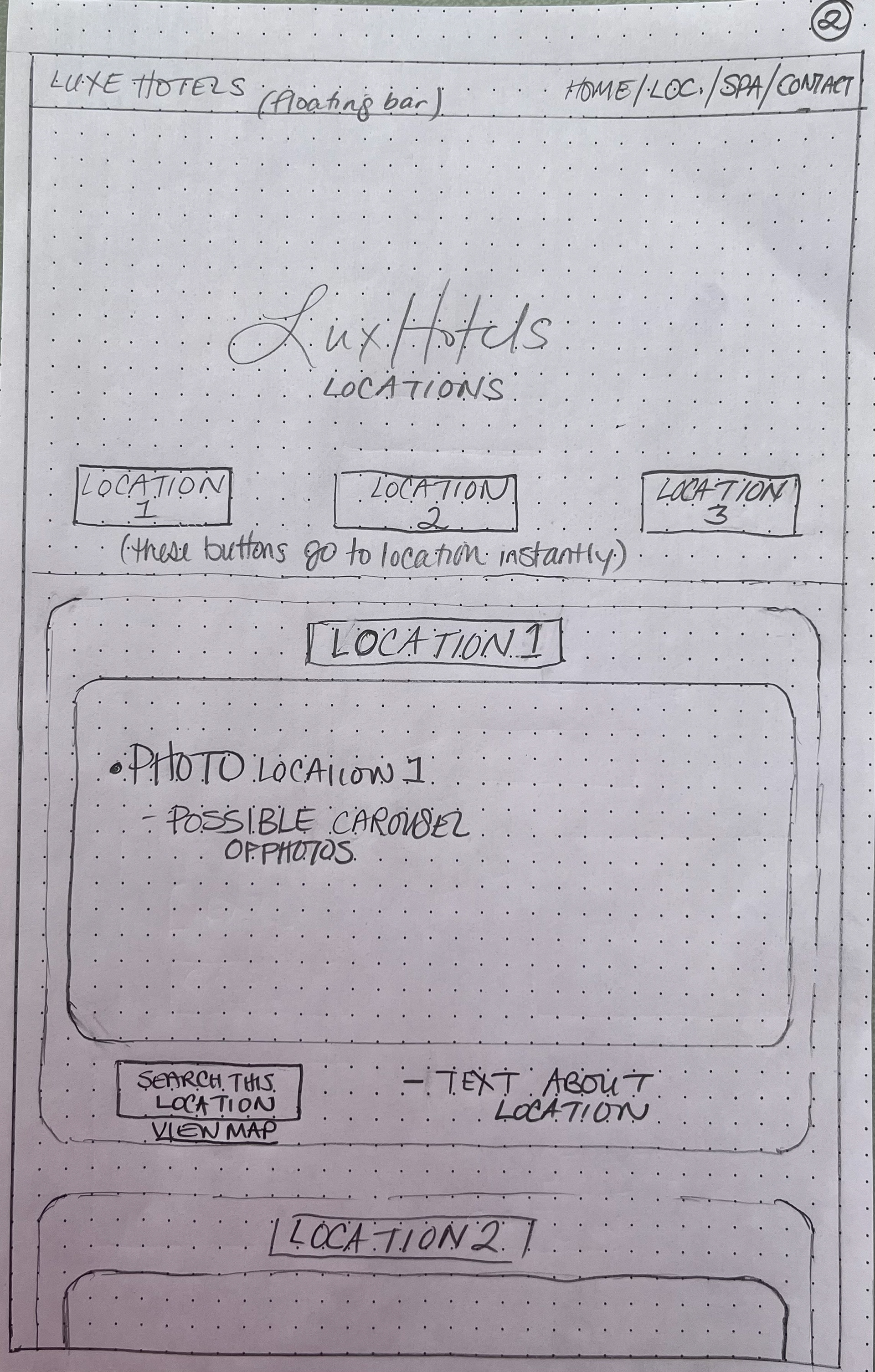
Hotel Locations / Maps
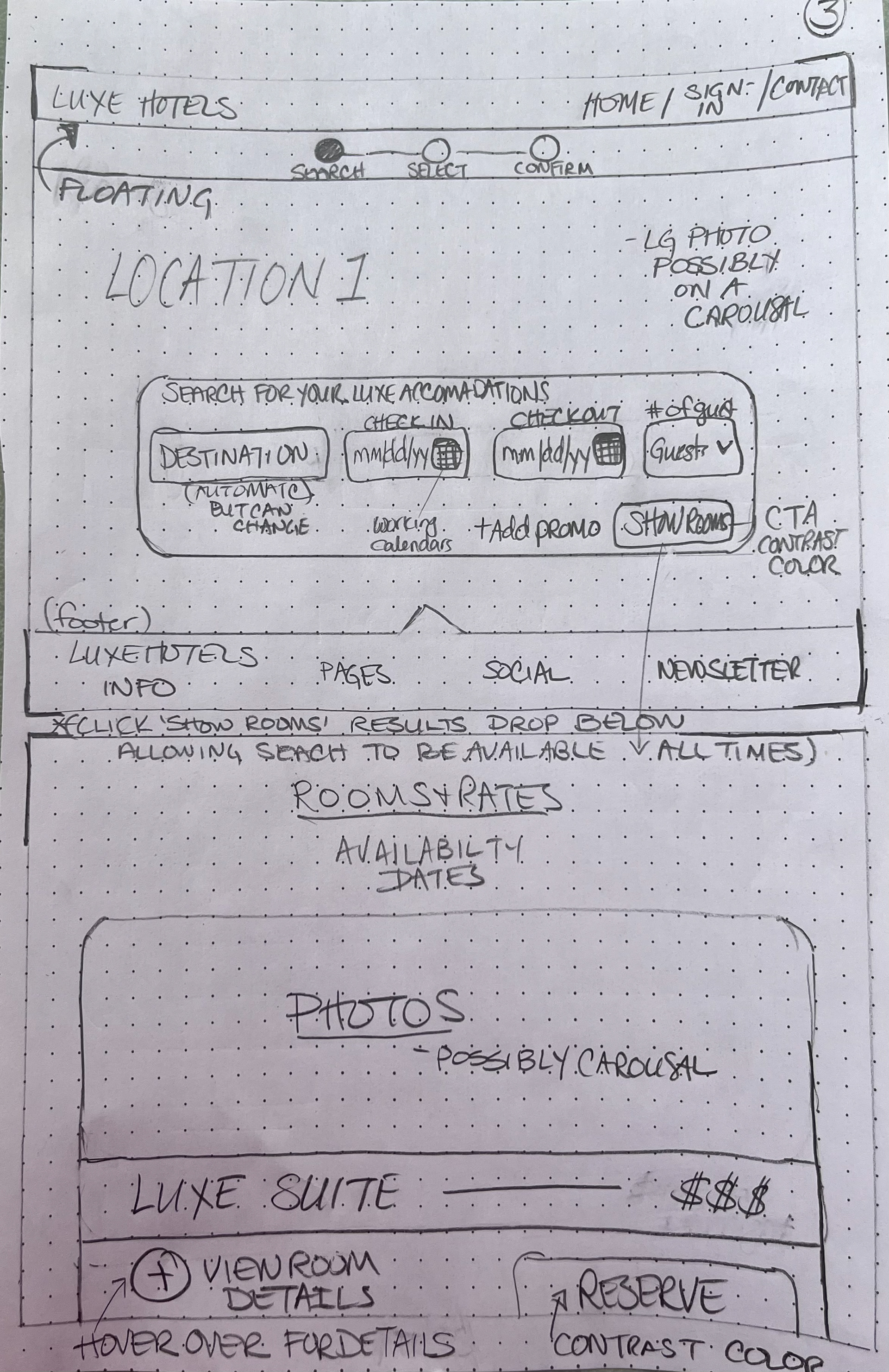
Search for a Room
Calls-to-Action (CTA) and Customer Support
Unclear CTAs and limited customer support access hindered user progress. I introduced consistent, visually distinct CTAs across all stages and included easily accessible support options. This was particularly helpful during the Payment and Confirmation steps because it helped the user resolve any doubts.
Inconsistent Floating Search Bars
Floating search bars were inconsistently used, disrupting user engagement in key areas. My designs ensured a universally available search bar across all relevant screens, allowing users to modify inputs seamlessly without interrupting their flow.
Visuals & Branding Alignment
Inconsistent visuals and branding sent mixed messages, undermining user trust. I reimagined the site’s aesthetic to align with the target audience, ensuring cohesive branding from the Home Page to Confirmation for a consistent and engaging user experience.
In conclusion, by mapping the user journey with a flow diagram and iterating through hand-sketched screen designs, I was able to refine layouts, improve functionality, and prioritize user needs. This approach ensured that every design decision was purposeful and aligned with creating a more engaging and efficient booking process.
To validate and address the identified findings, I developed a prototype to test potential solutions and gather user feedback.
Here's how I approached testing for each key issue:
Search Functionality- Tested an enhanced search bar, advanced filters, and map integration to ensure visibility and ease of use.
Calendars and Date Selection- Simplified calendar design tested for smooth date selection and clear availability.
Promotions and Discounts- Tested prominent, clear promotional banners to ensure visibility and user understanding.
Visuals and Branding Alignment- Evaluated cohesive visuals and branding to ensure alignment with the target audience’s expectations.
Calls-to-Action (CTAs)- Validated consistent CTAs, ensuring users could easily navigate.
Floating search bars and customer support features required significant reworking and testing to address usability and accessibility challenges. These elements are still being modified based on user feedback to ensure a seamless and intuitive experience.
This process will continue until the design is fully finalized.
I completed the design process by adding detailed annotations for the development team, outlining the functionality and behavior of the product to ensure it works as intended.
This UX design project focused on creating a seamless hotel booking experience by addressing key user pain points, including unclear search options, limited filters, and overlooked promotions. Through research, I mapped the user journey, sketched solutions, and developed high-fidelity designs in Figma. Prototypes were tested with users to refine features like organized calendars, prominent search boxes, effective CTAs, and map integration.
To ensure a smooth transition, I included detailed design annotations for the development team. This project highlights the value of research-driven, user-focused design in delivering a functional and engaging booking experience.
